
Animation and transitions are some of the most fun parts of interaction design. Color! Motion! Personality!
Standardizing
After analyzing our components, researching animation standards, and experimenting in Keynote/Principle, I created a set of rules for Study Tools activities. First, we would use standard easing (EaseIN/OUT), at 300ms (milliseconds), for all animation and transition styles. Since Study Tools activities had a linear flow from right to left, each screen would use the SlideLeft transition.
Customizing
For the multiple choice activity, we needed a more nuanced approach for feedback states. I created demo videos to show product and dev leads for design approval:

Building
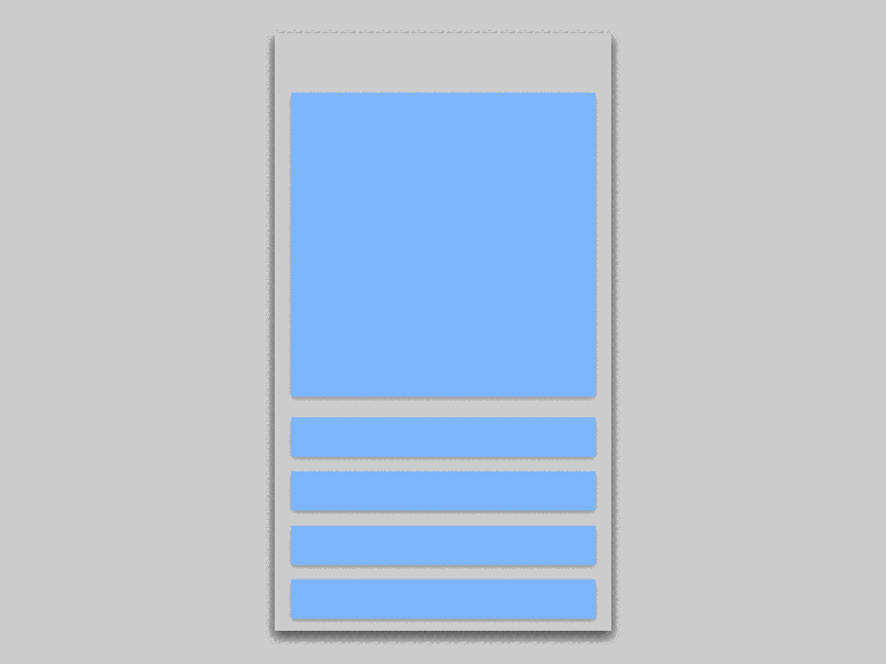
Once approved, I created wireframes and animation specs for developers, showing a flow for each interaction, along with demo .gifs, and interaction descriptions.

Scaling
This process has scaled to all of our animation sprints over the next year, reducing production time, inconsistencies in the build, and related QA bugs.
As a result of this work, our team had a set of rules for transitions, a process for designers to iterate or create new animations, and a consistent transition library across Study Tools and all our multimedia interactives on web, iOS, and Android.
You can read the full case study here.