
Animation and transitions are some of the most fun parts of interaction design. Color! Motion! Personality!
If you are working on a large feature set for a product, this fun stuff often falls into the backlog, especially for web projects. Yet gesture-based interaction is integral to the native mobile experience, and motion design on any platform helps users relate their action to visual feedback in the UI, which can aid comprehension.
In addition to native mobile, users have come to expect animation and gestures on all their devices. Some users pinch and zoom on trackpads, while others tap and swipe on touchscreen-enabled laptops. Accessibility can even be enhanced by gestures and animation. Users have also grown accustomed to frequent and subtle micro-interactions, even on basic web browsers, since the advent of Google Material Design.
In late 2016, transitions were not a high priority for Study Tools, as we focused on larger tasks in the MVP stage. We had a few transitions to move from one state or one task to the next, using custom and templated code across iOS Swift, Google, React, and CSS, as made sense for each component. In spring of 2017, we set aside a few sprints to clean up these transitions, and enhance the motion design of key components. We wanted to add lighter and more playful animation to Study Tools activities, to match the sophistication of our Flashcards animations, and to differentiate these tasks as more “casual”, as the formative, non-graded, practice assessments.
In other words, we used animation to define an activity as a low-stakes, and help separate it from similar activities used for summative, graded assignments.
First, I inventoried our existing transitions. Instead of 5-10 different animations, we wanted one style for all related tasks. In this case, we wanted all new items in a flow to SlideIn from right to left, at the same speed and easing. The first dev sprint was spent in consolidating these down to 1 SlideIn transition across all 3 platforms.

Next, I created various animated sketches to review the easing and speed of transitions. This was an opportunity for me to do a deep dive into animation research standards for mobile vs web, as well as play with Keynote and Principle. I had used Keynote or Fireworks for some quick animation demos in the past, but Principle offered a robust middle ground between the two, with the bonus of Sketch integration.
From this research and experimentation, I presented new standards for our animations:
- Use iOS defaults (iOS EaseIn/OUT, 300ms).
- For Tap Events and micro-interactions, use a faster transition speed (150ms).
- For Review “pause”, use 1.5 second pause before next transition.
For developers, I created more detailed animations using the timing above, with screens imported from Sketch with our sample content.

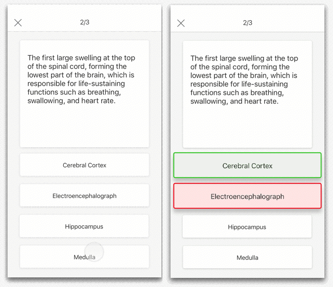
In order to spec out the animations for developers, I created a flow for each interaction, along with a page showing the demo .gif, and specifications.
The dev built these in code, and we tested the build with users. After user testing, it was clear that 1.5 seconds was not enough to review both the incorrect and correct answer in the multiple-choice activity. We increased the timing to a 2 second pause, and made sure users could also review their answers in the final summary screen.
As a result of this work, we had a set of rules in place for building transitions, a set process for designers to make changes or create new animations, and a basic library of transitions that was consistent across Study Tools and all of our multimedia interactives, on web, iOS, and Android.
From summer of 2017 onward, our visual designer was able to iterate on the UI, layering color, texture, and whimsy on top of our existing animations. As a design team, we were also able to collaborate on additional micro-interactions and transitions for other components, now in record time, using our existing template. By the end of the summer, our dev leads and visual designer began to explore more sophisticated tools for exporting custom code from layered animation files. But the standards, rules, and design template for presenting animation specs to developers stayed consistent. We have shared these standards and demo’d tips to designers across Pearson, and I am proud to see how we’ve been able to scale our animation process to other teams.